
Designing a Place, Not Just a Logo
A former industrial site becomes a cultural crossroads — and the identity system built to hold its contradictions.
Foundry Heights was envisioned as a new cultural crossroads in Uptown Charlotte: a mixed-use destination connecting restaurants, retail, entertainment, and residential life. Working within Shimahara Visual’s strategic framework, I helped translate that positioning into a bold, flexible identity designed to live across architecture, marketing, digital, and environmental touchpoints.
role
Graphic Designer
Agency
Shimahara Visual
Client
Asana Partners
focus
Identity System · Environmental · Digital
The Opportunity
A destination needed more than a logo
The brief wasn't a logo. It was a language flexible enough to honor the site's industrial past while expressing the energy, openness, and cultural momentum of its future.
STRATEGIC FOUNDATION
-
Positioned as a cultural crossroads connecting Uptown Charlotte and its surrounding neighborhoods.
-
Balanced four core ideas: accessible location, industrial charm, cultural energy, and residential life.
-
Defined a personality that felt connected, distinctive, vibrant, and inviting.
01 - Exploration
Exploring three different directions.
We explored three distinct territories, each a different bet on what Foundry Heights could feel like. I pushed for the direction that balanced energy with restraint — a condensed wordmark with real movement, a palette (merlot, olive, sunset orange) that felt warm rather than corporate. The other two directions were more expected; this one took the bigger risk and paid off.

02 - The CHOSEN DIRECTION
A flexible identity for the neighborhood.
We explored three distinct territories, each a different bet on what Foundry Heights could feel like. I pushed for the direction that balanced energy with restraint — confident enough to define a destination, flexible enough to survive contact with a large, varied environment. The other two directions were more expected; this one took the bigger risk and paid off.

A custom wordmark with movement and personality.

A palette of merlot, olive, sunset orange, chardonnay, bright white, and nightfall.

Photography that places people at the center of the experience.
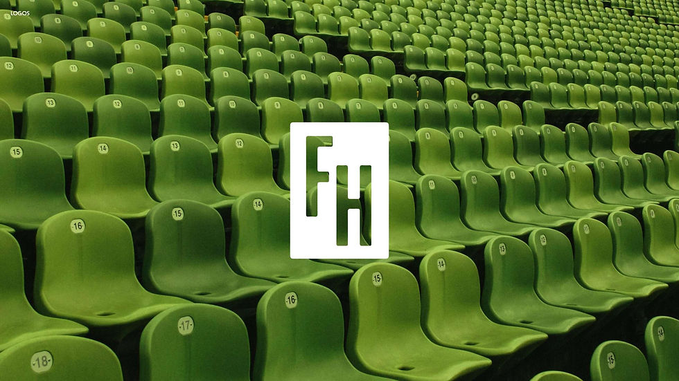
A compact FH monogram designed for environmental and small-format use.
03 - system
A System Built for Place
The selected direction became more than a logo. We developed a flexible visual system—combining expressive typography, a distinctive monogram, an energetic color palette, and lifestyle-led imagery—that could adapt across the many ways people would encounter Foundry Heights. From marketing materials and digital touchpoints to banners, signage, and the built environment, each application helped make the identity feel embedded in the destination rather than placed on top of it.


More selected work:
Designing a Place, Not Just a Logo
Foundry Heights — Created at Shimahara Visual for Asana Partners

Creating a Retail System for Growth
Created for Bed Bath & Beyond's Owned Brands initiative
.jpg)
Designing for Growth
Shaping Willow from a single-product into a modern maternal care brand.